HDR photography, is a method that aims to add more dynamic range to photographs, where dynamic range is the ratio of light to dark in a photograph. Instead of just taking one photo, HDR uses three photos, taken at different exposures. What I like about HDR photography is that it can take up to seven photos with different
exposures and take all of them and create a beautiful shot that really brings out the details of that place. There isn't really anything that I dislike about HDR, but one thing might be that when taking a picture of a crowded place or with movement, it tends to make the picture turn out bad.
When creating a HDR picture you start by finding a location where there are no people(so there is no movement). Then you start at the exposure of -3 and work your way up to +3 or if you want you can go from +3 to -3. Then you take the seven photos and merge them to HDR pro in
Photoshop. Then you can edit the picture it creates! Whats different between HDR Photography and the automatic HDR functions is that the first one takes up to 7 photos ranging from light to dark, but when using just the automatic HDR it only takes one photo.
When I created the two HDR images, there was definitely a thought process to it. First I had to make sure that wherever I took this photo, it would be creative and also that there wouldn't be any people in my shot because of movement. Then I noticed that right after you take the first shot at -3 and you go to change it to -2, if you move the camera or the tripod just a little bit, it may mess up your HDR photo. Then when I was finished taking my seven photos, I went back to the classroom. I merged the photos to HDR Pro and started editing them, in Photoshop.


Great color in the landscape and I love the bold text!
ReplyDeleteHer head gets a little bit cut off
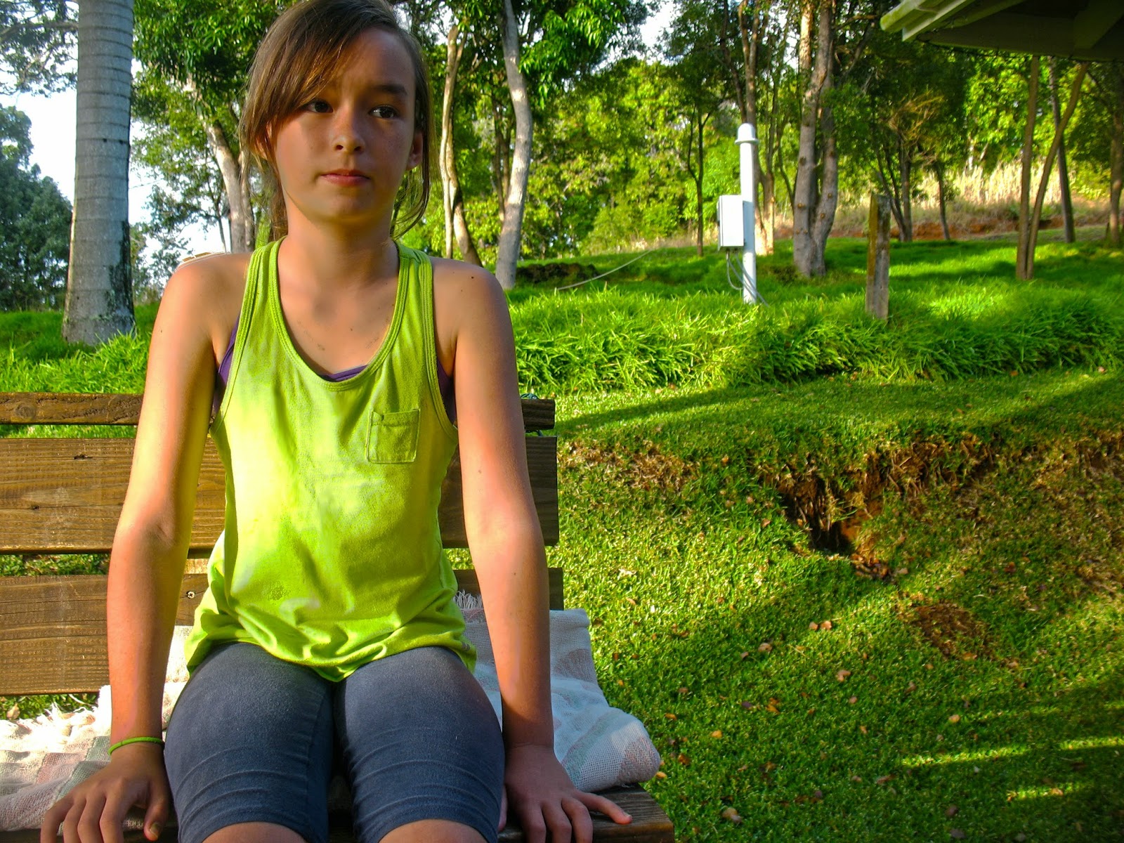
I love her facial expression and rule of thirds is awesome!
Hey! I really like the different colors in both the experiment photo and the landscape photo! The greens really pop out which I like. You did a great job on the rule of thirds!
ReplyDeleteNice rule of thirds. Not very surreal. Over all good job.
ReplyDeleteGood use of rule of thirds! I think that you could have refined your edges a little more. Very surreal!
ReplyDeleteReally nice and colorful picture. It could be more surreal. Good experiment.
ReplyDeleteGood bright color, the surrealism could have been better, but the cut out quality looks great to me!
ReplyDeleteThese images are much more true to life instead of surreal. But you got the rule of thirds down and you have a pretty good focal point. Nice work!
ReplyDeleteI don't know why but probably after Leila's Super Impose but I wished you included the bench. I really like how big your text was and how spaced out it was. However, the text color isn't from your background, maybe like green or something! Though, your cut-out quality is pretty good!
ReplyDeleteNice cut out quality! Your text could definitely be improved, maybe make it a better color and decrease the opacity. Awesome rule of thirds and decent focal point.
ReplyDeleteAwesome landscape! One thing you can make better is the surrealism of your subject. Overall, I love the photo!
ReplyDeletegreat writing
ReplyDeletenext time bring all your images to the botom
great images
Great background! Your surrealism could be better, but your cut out is amazing!
ReplyDeleteAwesome job using your rule of thirds! I feel like this could be a bit more surreal, but I love the colors in both your portrait and landscape.
ReplyDeleteI really like your landscape. I think that you could have made the portrait a little more surreal and given more thought to rule of thirds. Pretty great cut out quality.
ReplyDeleteI like your landscape. It could have been more surreal. I like the expression that she has.
ReplyDeletegreat bolg love it. good word
ReplyDeleteThe rule of thirds look quite nice. The color of the word could be changed and the opacity turned downed, but your cut out quality is nice. Good job.
ReplyDeleteI like the fact that it looks like the girl in your pictures was already sitting there.
ReplyDeleteI think you could have made the landscape and portrait look more surreal.
I also like where you put the word.
Great job on your landscape and good cutout quality, maybe change the color of the text and maybe position her in a good looking space area, but this is a pretty well done job.
ReplyDeleteGreat work! I really like where you placed your subject!
ReplyDeleteI believe you could have changed the color of your word, so it could match the color scheme more.
Also, great cut-out and choice of word!
Great pictures! I really like your experiment photo. I think that you could've changed the word's color, but all your photos are well taken and great.
ReplyDelete